Looking for the best Canva color palette tips to make your designs unforgettable? 🎨 You’re in the right place! Whether you’re just starting out or already a design pro, mastering Canva’s color tools is the key to creating eye-catching visuals that grab attention. In this guide, we’re diving into 10 Canva color palette tips for beginners and experts, packed with creative ideas, actionable steps, and expert insights. From understanding color theory to using Canva’s color palette generator, you’ll learn everything you need to craft jaw-dropping designs that wow your audience. Let’s add some color magic to your world! 🌈
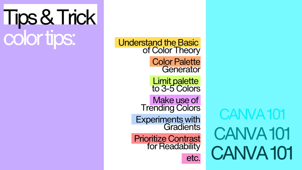
1. Understand the Basics of Color Theory
Before diving into Canva’s tools, it’s essential to understand color theory, the foundation of any great design. Primary colors, such as red, blue, and yellow, serve as the building blocks for all other shades. Secondary colors, like green, orange, and purple, emerge when you mix primary colors, while tertiary colors combine primary and secondary hues for more nuanced tones. Understanding how colors interact, whether complementary, analogous, or triadic will help you create harmonious and visually appealing palettes in Canva.
2. Use Canva’s Color Palette Generator
One of Canva’s standout features is the Color Palette Generator, which allows you to create a palette based on any image. Simply upload photo, and Canva will extract its dominant colors, giving you ready-made palette. This feature is particularly helpful for maintaining a cohesive theme, especially when designing around a specific image or mood. For instance, you can use a photo of a sunset to capture warm, inviting tones or a cityscape to create a sleek, modern vibe. Test this feature directly on Canva’s Color Palette Generator
3. Limit Your Palette to 3-5 Colors
A well-balanced palette often includes just three to five colors. This limitation ensures your design remains cohesive and avoids overwhelming the viewer. Start with a base color that dominates your design and use one or two accent colors to draw attention to key elements, such as headings or buttons. Neutral colors like white, gray, or beige can help balance out vibrant shades and your design a clean, polished look. Canva’s pre-made palettes provide an excellent starting point if you’re unsure where to begin.

4. Make Use of Trending Colors
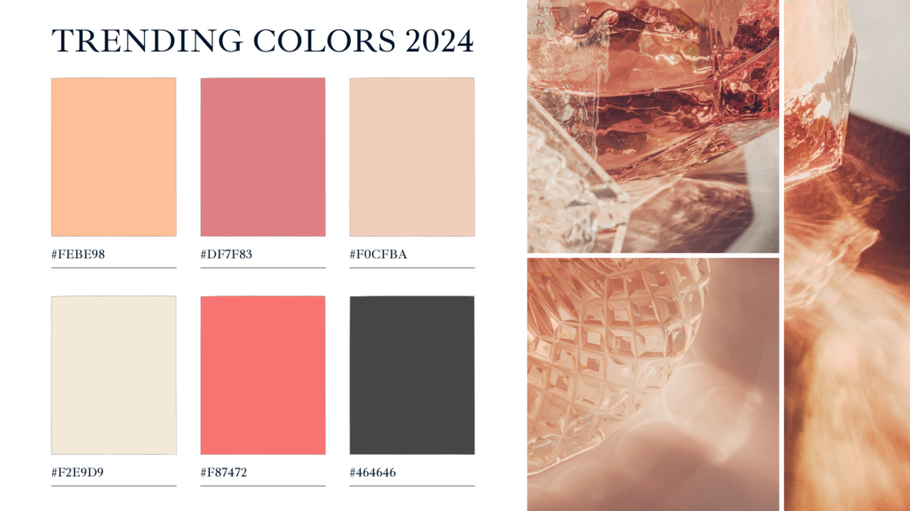
Incorporating trending colors can give your designs a fresh and modern look. For 2024, digital lavender, a soft and futuristic purple, is gaining popularity, along with earthy greens and warm browns for natural and comforting aesthetics. If you’re aiming for bold, energetic visuals, vivid reds are an excellent choice. To stay updated on color trends, visit Pantone’s Color of the Year.

5. Experiment With Gradients
Gradients are an effective way to add depth and texture to your designs, and Canva makes it easy to use them. Gradients blend two or more colors seamlessly, creating a smooth transition that catches the eye. You can use gradients for subtle backgrounds to add sophistication or bold overlays to highlight specific sections of your design.

6. Prioritize Contrast for Readability
Good contrast is essential for ensuring your design is clear and accessible. Pair dark text with light backgrounds and vice versa. Canva’s built-in accessibility checker can help ensure your designs are legible for all viewers, including those with visual impairments.

7. Play Around With Canva’s Color Picker Tool
Sometimes, the perfect color isn’t in a pre-made palette, and that’s where Canva’s Color Picker tool shiner. This practical feature lets you grab any color from an image or your design elements. Want to match the exact shade of a brand logo or the subtle hue of a sunset? Just click the color picker, hover over the desired area, and watch the magic happen. It’s a quick way to create cohesive and personalized palettes for your designs.
8. Use Real-Life Examples for Inspiration
When creating palettes, think about real-world applications. A coffee shop might use pastel and yellows for a soft, inviting vibe, while a tech company could opt for sleek blacks and blues for a professional feel.

9. Use Canva’s Templates as Color Inspiration
If creating a palette from scratch feels overwhelming, Canva’s pre-designed templates are a goldmine of color inspiration. These templates often come with professionally coordinated palettes that you can tweak to suit your needs. By starting with a template, you not only save time but also gain insights into how colors work together in real-world design.
10. Test Your Designs Across Platforms
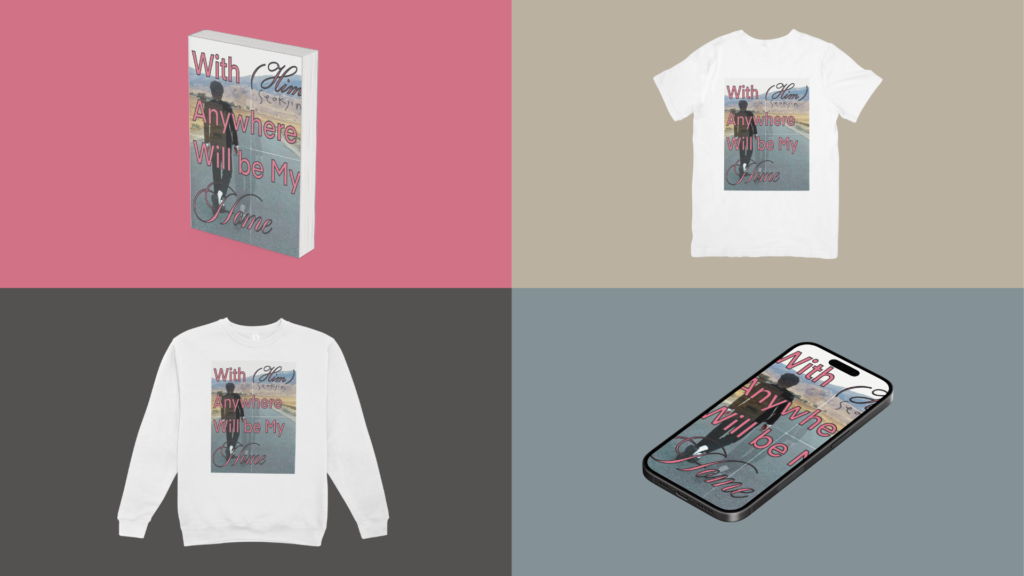
Colors can appear differently on screens and in print. Canva’s mockup tools allow you to preview your designs across various platforms, such as social media posts, websites, or printed materials. Testing ensures your palette maintains its impact no matter where it’s used.

By mastering these 10 tips, you’ll unlock Canva’s full potential and create designs that are both visually stunning and professional. Whether it’s understanding color theory, experimenting with gradients, or using Canva’s color palette generator, each tip helps you refine your skills and stand out in the design world.
If you’re ready to dive even deeper into Canva’s features, check out our related posts:
- 3 Canva Tricks You Probably Didn’t Know About
- Creating Minimalist Infographics in Canva for Data Driven Presentations
Start experimenting with Canva today, and transform your creative vision into reality!
0 Comments